Agfachrome
I have a lot of old cameras (another vast collection that I want to give move love and consideration to) and often they come with little manuals and pamphlets.
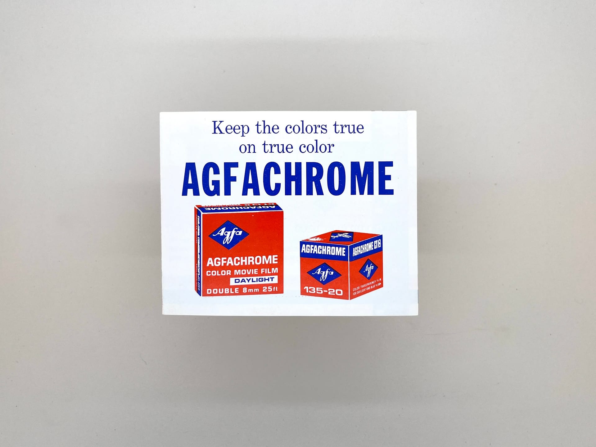
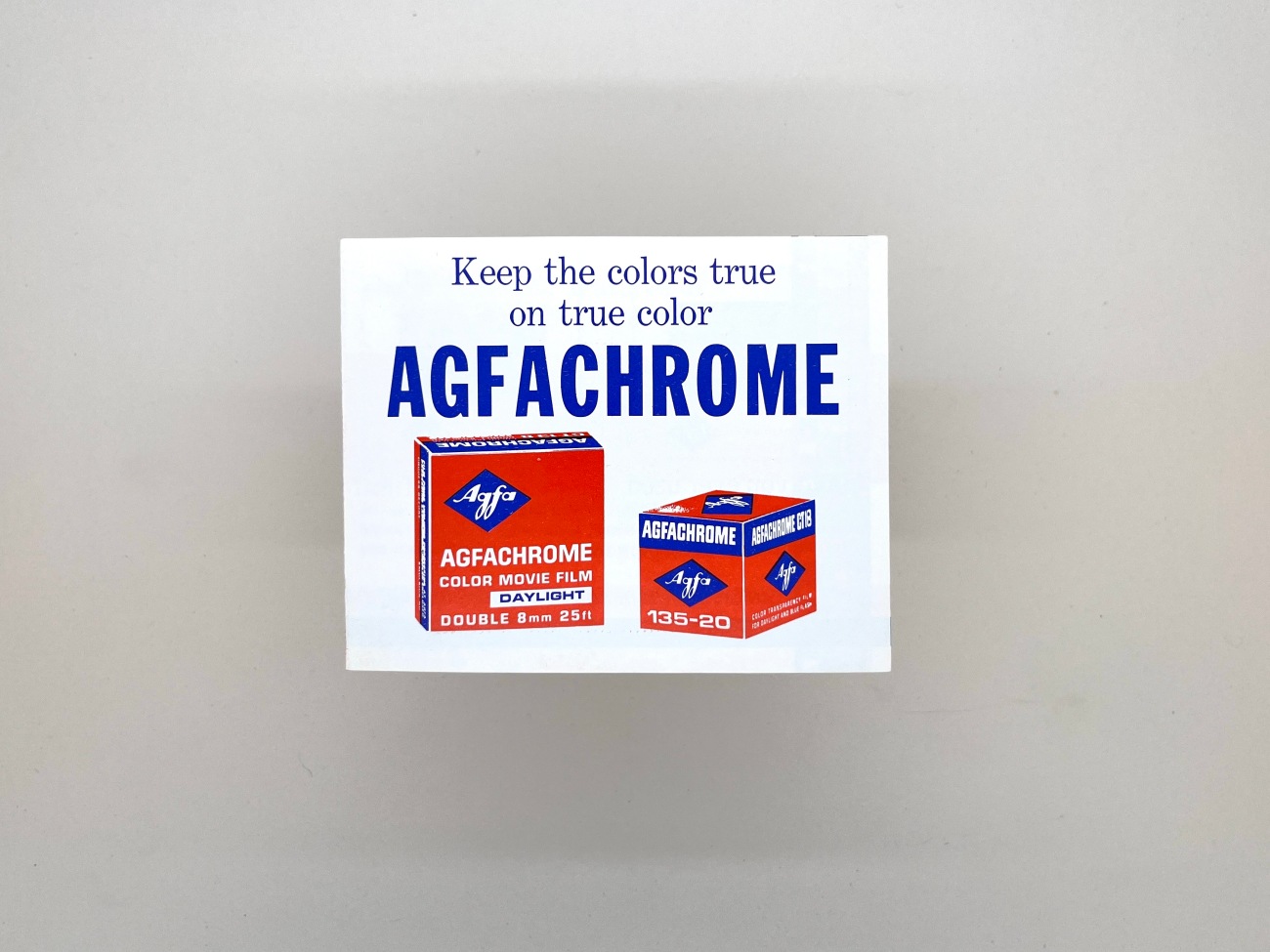
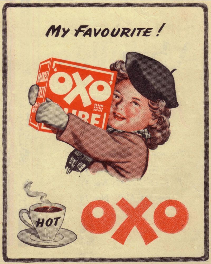
There's something about this one that feels super old, a bit old, retro, classic and even now a little contemporary that I find fascinating.
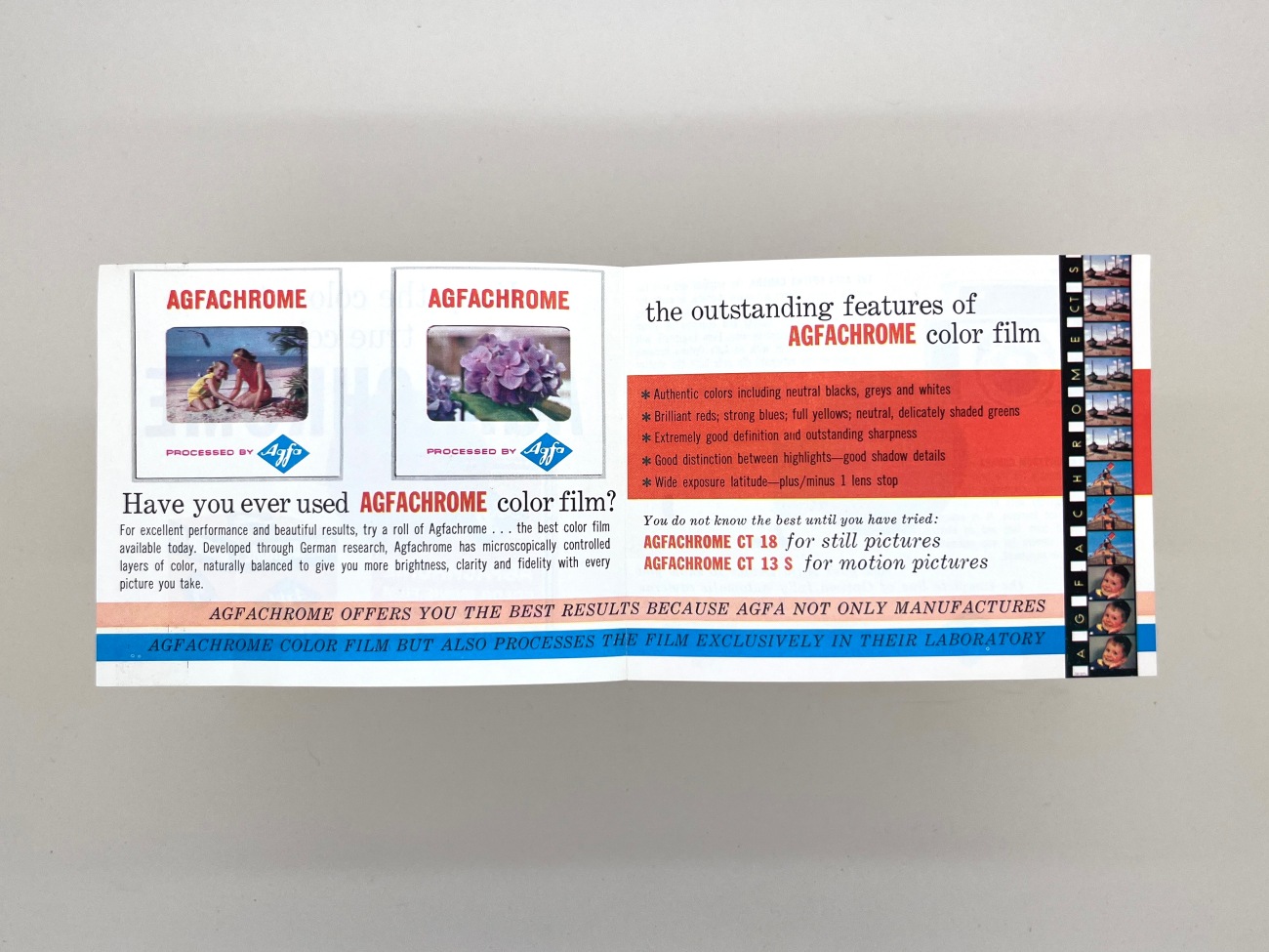
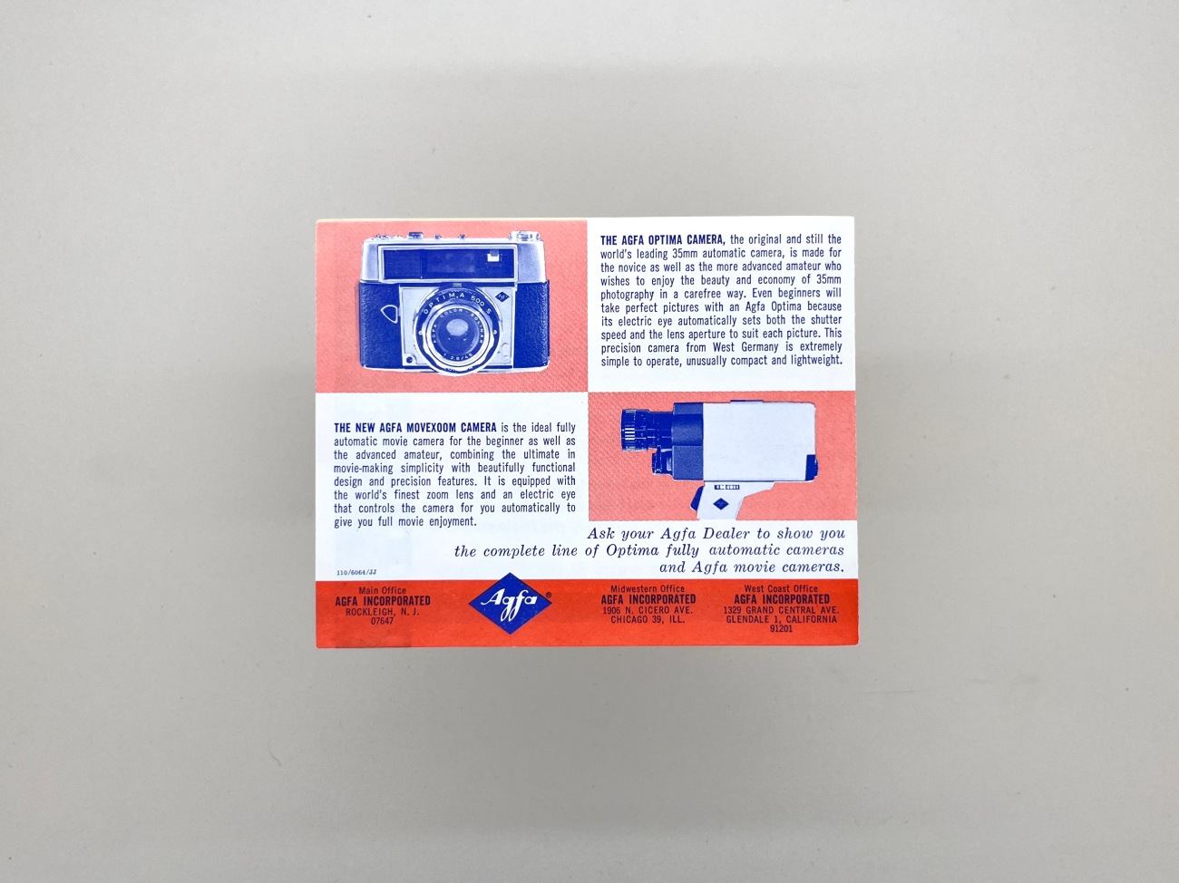
The first page feels like it's an early 1900s Oxo advert, then the inside jumps to a 70s or 80s looks and feel, then we're into a more modern trendy halftone filter like feel for the back page.
It's the front page that I think I mostly kept this for. The odd perspective, the clunky "Keep the colours true on true colour" strapline, and the simplicity of being able to advertise a product by showing its box.