Public notice design patterns

After finding The Causal Optimist blog and seeing a post on book covers, this one reminded me of my own neighbourhood form/sign, and that I was going to dig out some favourites in what is essentially a design pattern of public notices being played for laughs.
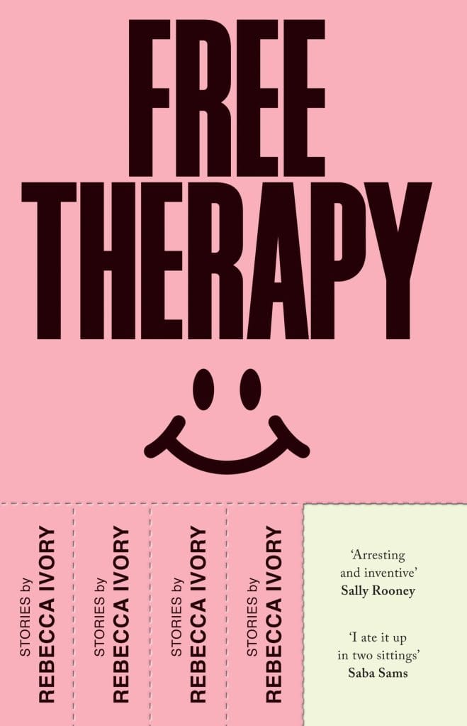
Free Therapy by Rebecca Ivory; design by Luke Bird (Vintage / March 2024)
A recent well done version of the tear-off-tab gag is from the wonderfully absurd Pablo Rochat (video on Instagram):
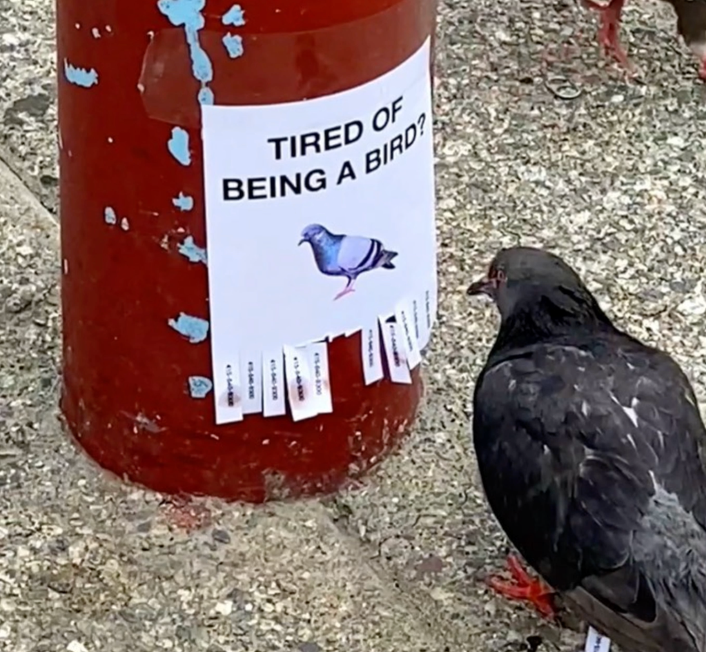
Tired of being a bird? By Pablo Rochat, 2021.
The first version of the tear-off-tab that I remember being used for fun was a very simple sign that offered little tabs of 'hope' to be torn off. Annoyingly though I can't find it. It must have been from the early 2000s, but finding it again in this haystack of copycats/remixes is sadly impossible.
Excitedly though, I was able to track down this utter classic:
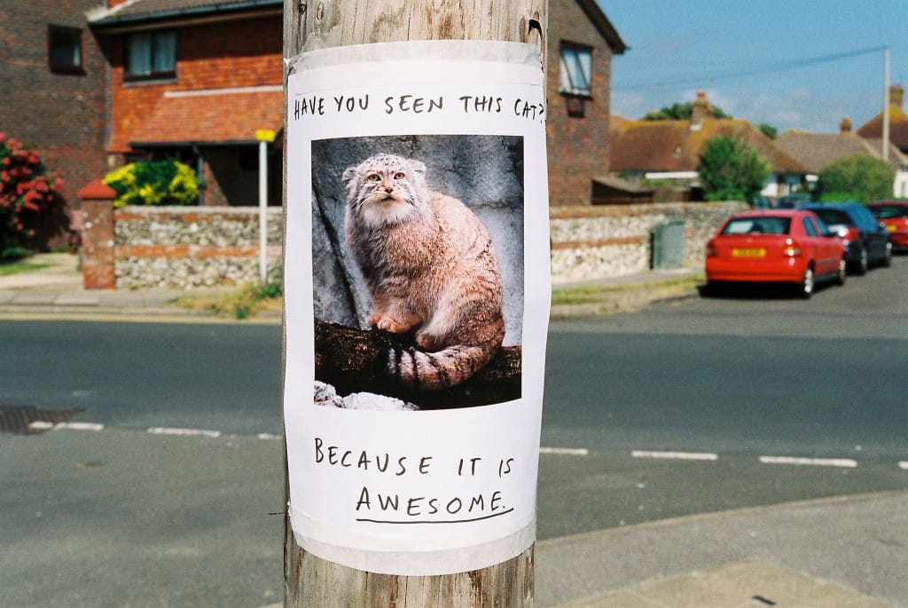
Have you seen this cat? Because it is awesome, from Lizzy Stewart's Flickr, 2008 (I had totally forgotten that this was source, and had to do a load of reverse image searching to find it. Glad it got there in the end).
No tear-off, but in my opinion, still the best ever play on the DIY public notice format. Format, pattern, system, trope? Oh, how these words overlap in annoying ways.