YES NO VOTE!
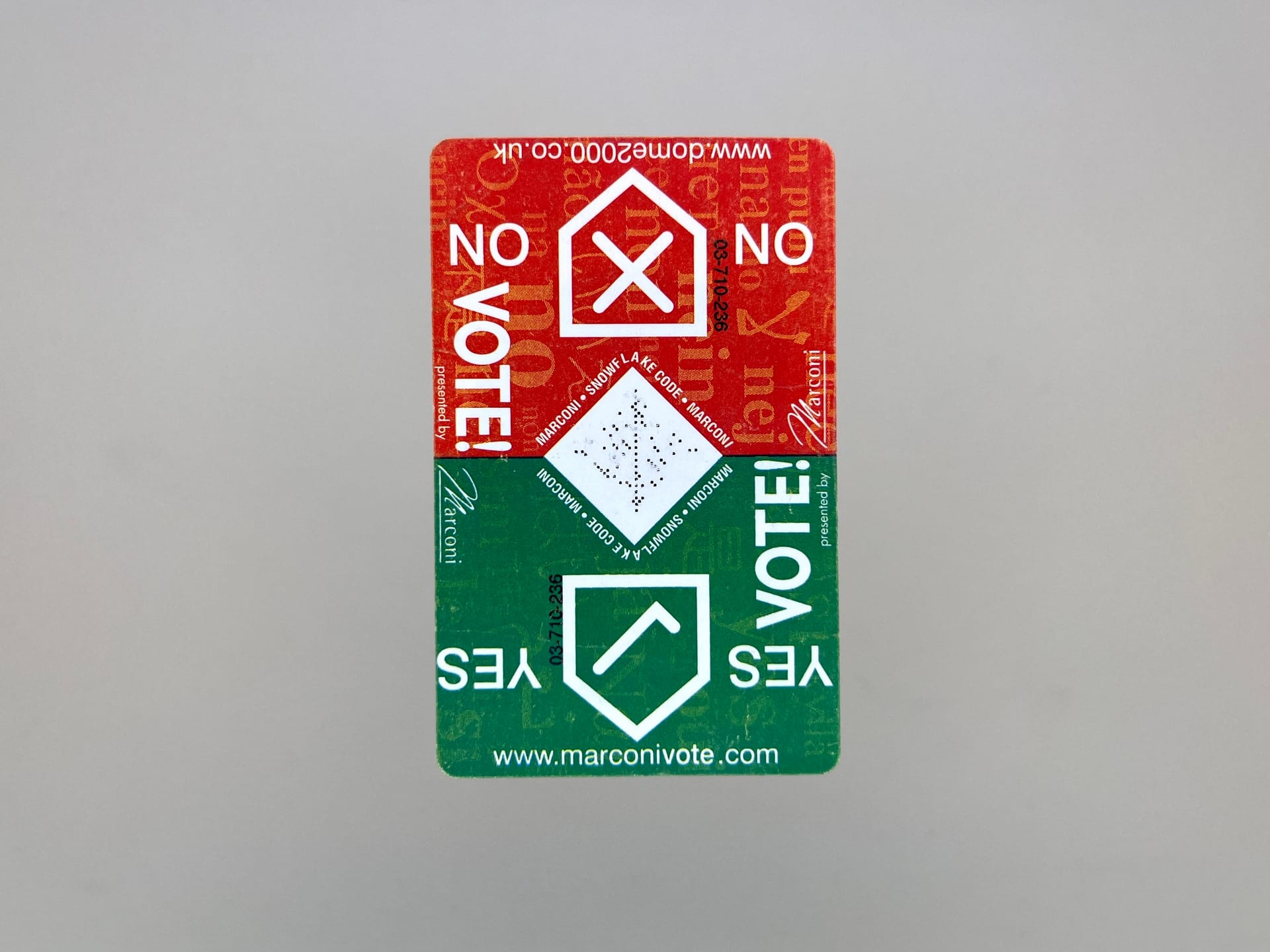
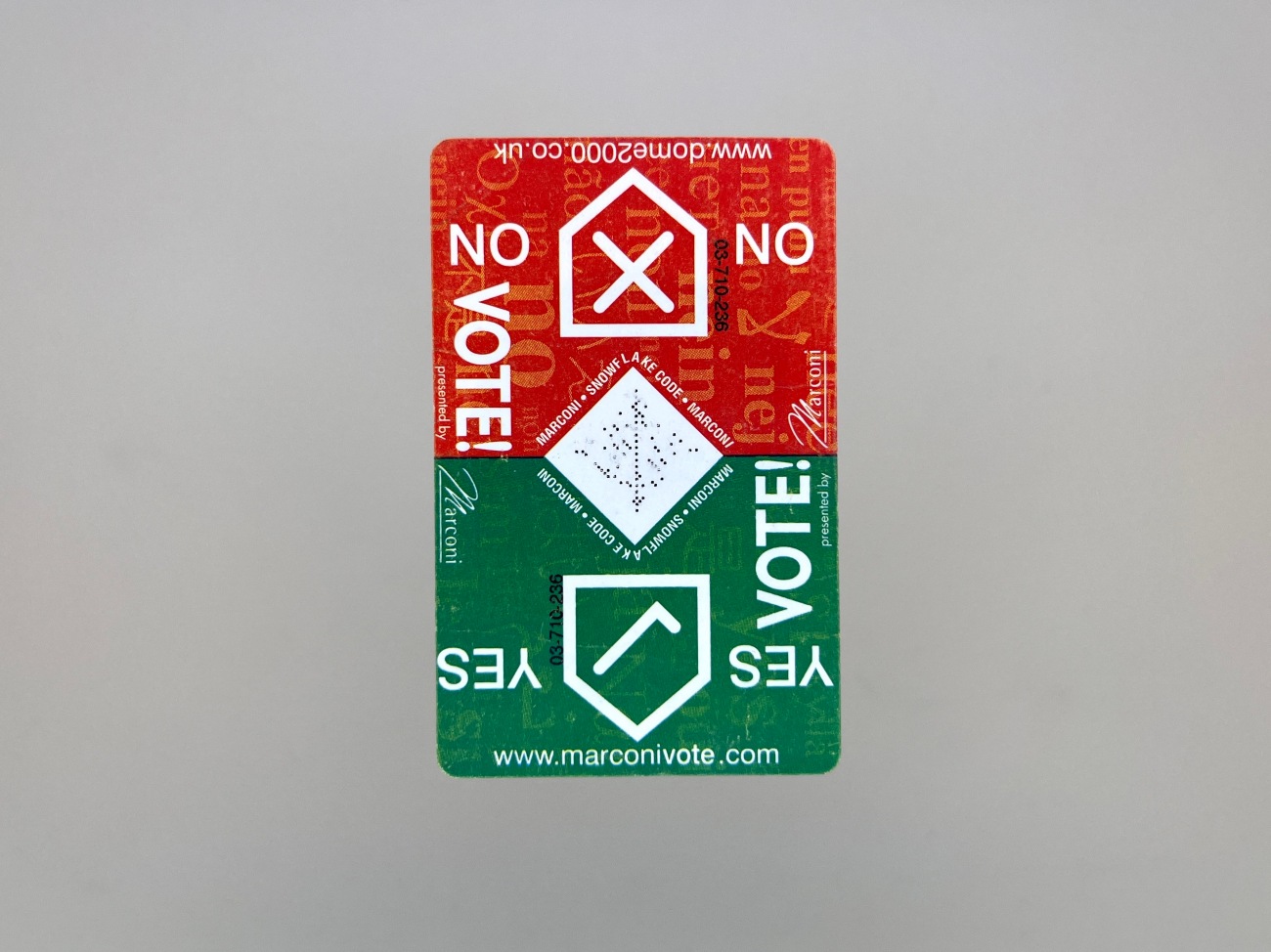
This piece is really old. A 1999/2000 Millennium Dome Marconi Vote card. Not sure how it ended up in a box with mostly 2005-2009 bits and bobs, but here it is.
If you didn't know, the Dome, now The O2, was a big odd flop. Most people went to it with the same impulse as looking at a road accident. I did. And in that sense it was as expected. And thinking about it now brings the Glasgow Willy Wonka Experience to mind. See for yourself.
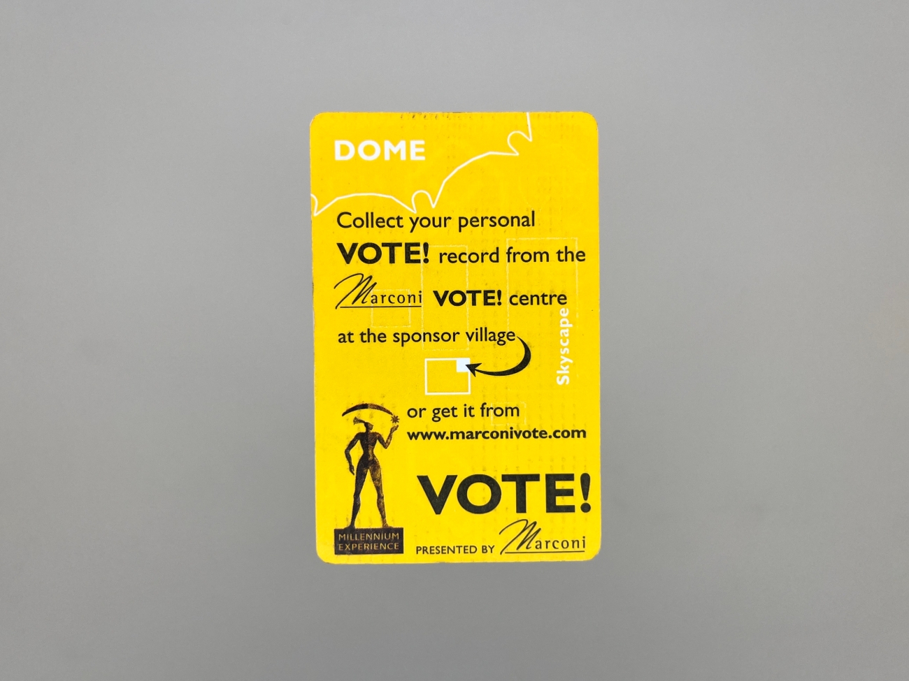
I don't really remember what this card was for. I think there was a large interactive experience inside that it let you contribute to when you got home (this being many years before an internet connected cel network). But the rear suggests it gave you a certificate of some sort. I half remember thinking the front of the card looked kind of cool though. Cool enough at least to keep as my only souvenir.
The middle of it has the look of a QR code which makes the design feel curiously younger than its 25 years. In fact, looking closer at it, I wonder if it was some kind of early version. I could only find one other poor quality image of another one, and it has a slightly different arrangement of dots.
The yellow rear of the card has such a 90s feel to it that I find it slightly painful to look at. The fact that graphic design can look so inarguably cool and current and amazing at one point, then sad and naive and awkward years later, has always made me distrust it slightly. Revealing how it's more about trend than truth.
That's partly why I never felt at ease with commercial graphic design as a career path, and why my favourite design tends to be timeless, like anything by Alexey Brodovitch or Reid Miles. Or capable of fitting in and feeling pleasing in almost any period, like De Stijl or Bauhaus. Which is perhaps where the front of this card fits in.